Calligraphy isn’t easy but the process shouldn’t be painful. So here’s my top 5 untold lessons on how to get better results in Calligraphy!
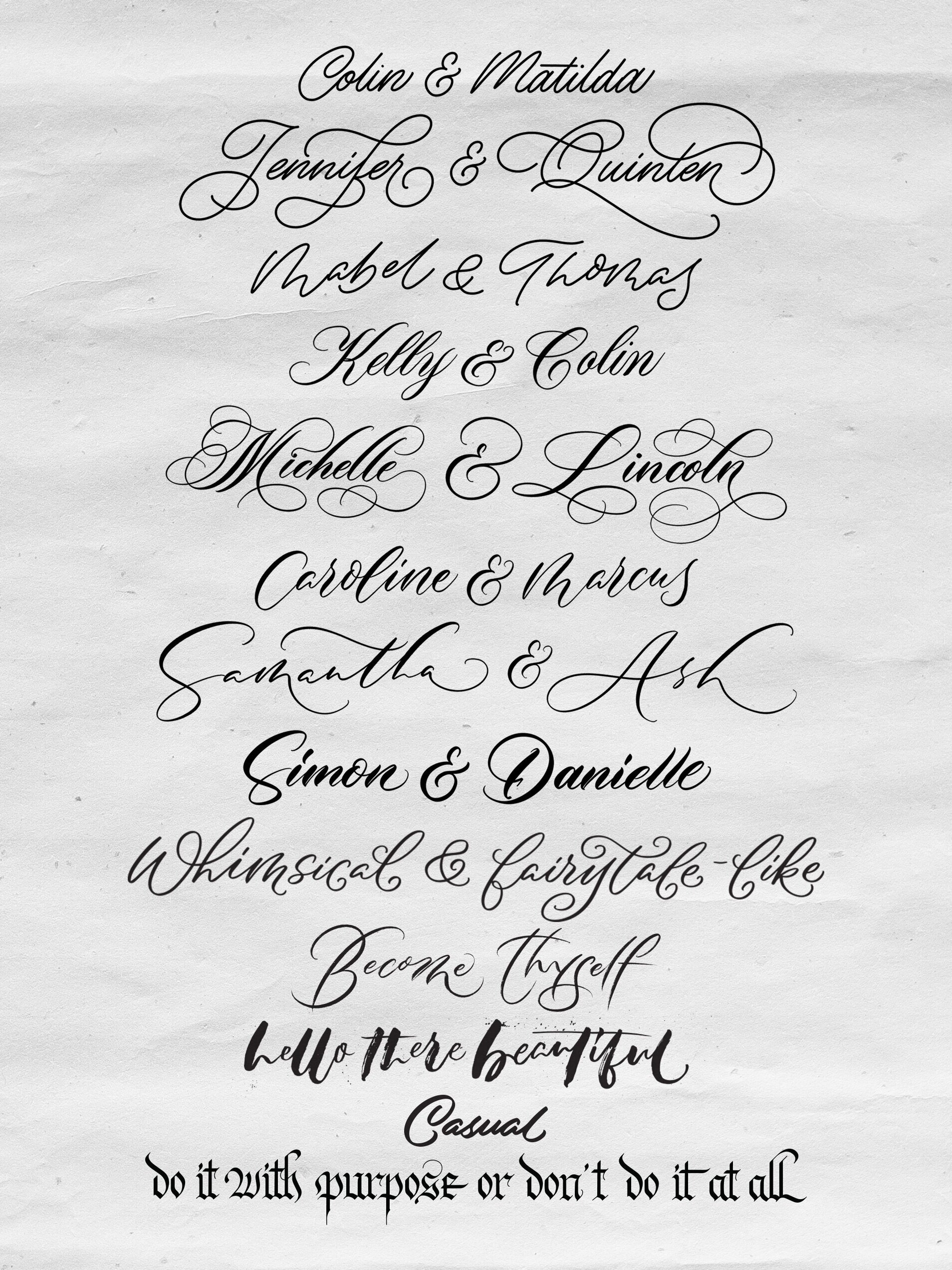
A myriad of fun calligraphy styles I drew on Procreate and analogue (paper) and compiled in Adobe Photoshop
Master your basics first.
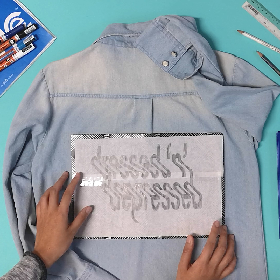
If your letters don’t look good in pencil, they probably won’t too with a brush pen or pointed pen.
Similarly, if your base script foundation doesn’t look good, piling on flourishes won’t mask the mistakes either.Be legible first, fancy later.
Imagine: your letters are the base foundation of a cake and flourishes are icing on the cake. If a cake looks good but tastes bad, would you eat it?
So - if the script looks fancy, but it’s hard for someone to read it, would you say it has served its purpose*? Remember, good design serves both visual appeal and practical functional use.
(*Notable exception: abstract art)Know what you’re studying and what you’re practising.
Traditional script follows consistent rules and guides. Modern calligraphy breaks them.
First off, there are many different types of traditional script. It’s important to focus on one style before moving on to the next as individual scripts would display different traits and features such as slant angles, letter ratios, letter connection, stroke contrast etc. If you’re learning both Copperplate and Spencerian at the same time, it may be confusing! Plus, it’s easier to gain muscle memory focusing on a single script first than multiple scripts.
Pablo Picasso once said — 'Learn the rules like a pro, so you can break them like an artist.' That’s where the fun starts.Observation first, practise later.
Most would preach “quality is more important than quantity”, but there are also merits in quantity leading to quality over time.
But hey - why not both? Quality AND quantity ie. train your eyes first before training your hand. Now that our eyes are trained to spot the differences between good and bad work, next - let’s put in the practice hours to train our hands, and bring our work from good to great.
Don’t be wasting time practising a stroke 1,000 times incorrectly, this just reinforces bad habits which have to be unlearned later on.Challenge your mind: question everything, assume nothing.
When it comes to learning, reignite your child-like curiosity. Challenge your mind: question everything, assume nothing - that’s where we can gain clarity and fully comprehend why things are the way they are.
If not, we’d just think we know when we actually don’t. And even if you can’t find an answer right away, you’ll probably learn way more in your search for an answer than assuming the status quo is right.
I hope you’d find these lessons helpful! I wish someone told me all these when I first started. If you’re feeling ready to level up your calligraphy, feel free to check out my online course (with a free class available to watch). I’ll share and teach you all I know.
Meanwhile, I’d love to hear your thoughts. If you’ve any questions - comment below, I’m here to help!
Cheers,
Leah