I had a bunch of champagne bottles to customize and I decided, you know what, let me walk you through the process and share 6 pro tips with you!
Tip 1: How to hold or secure the bottle
Option 1: You can put a cushion underneath your bottle and it will be a lot easier on your hands so that you don't have to carry it.
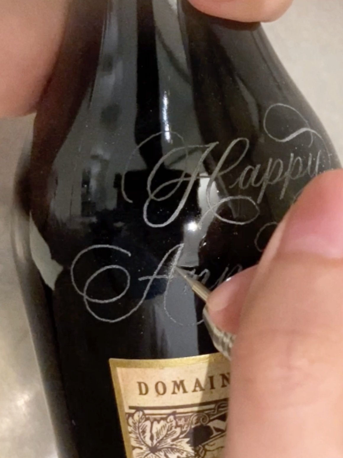
Option 2: Hold the bottle by the neck with your non-dominant hand, which is my preferred method because I find that it's a lot easier to pivot the bottle in small increments so I'm essentially tilting the bottle bit by bit, pivoting it against the table at the bottom of the bottle.
Imagine the bottle is tilted up at an angle and this allows me to visualize a straight line easily without any parallax error. I generally go for the second method, but if you find it a bit tough on your wrist, you can go with option one: using a cushion underneath and still tilting the bottle. It's just a bit more tedious - just imagine you have the bottle flat down and you have to overarch your back or neck to look at the bottle compared to tilting it up with your hand so that it faces you.
Tip 2: If you make any mistakes, use an alcohol wipe to scratch the ink off
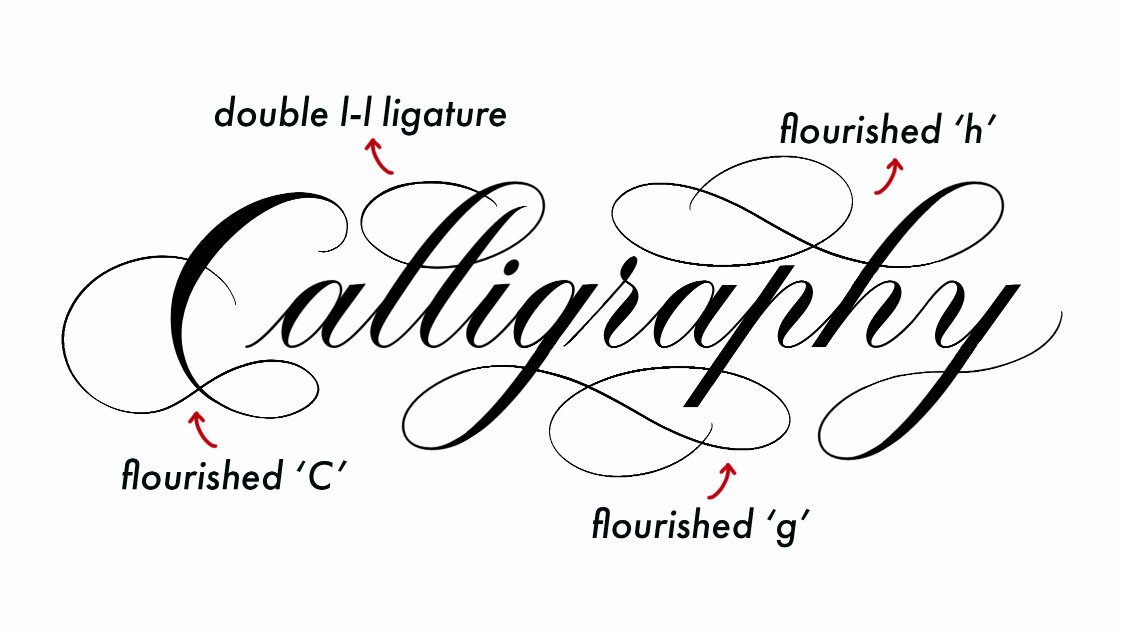
Tip 3: Add flourishes or decorative illustrations to centre / balance your composition

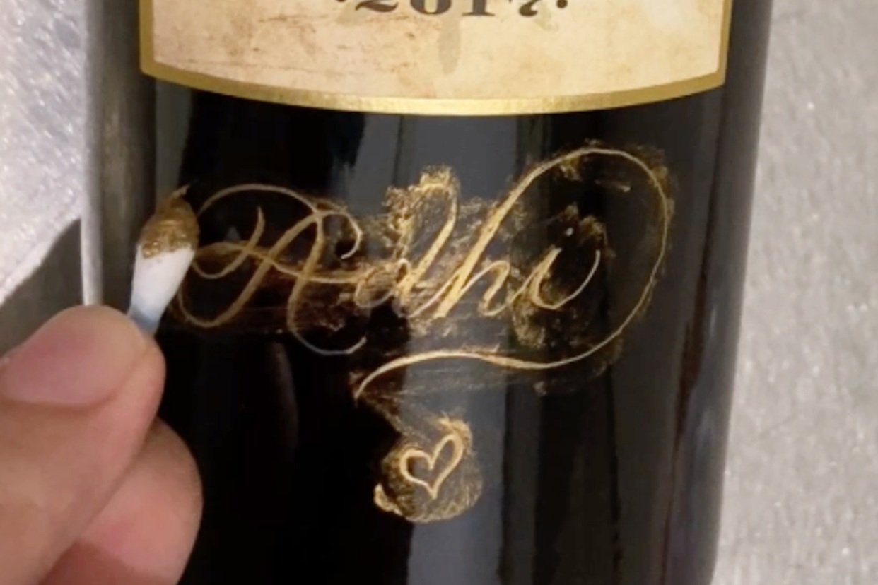
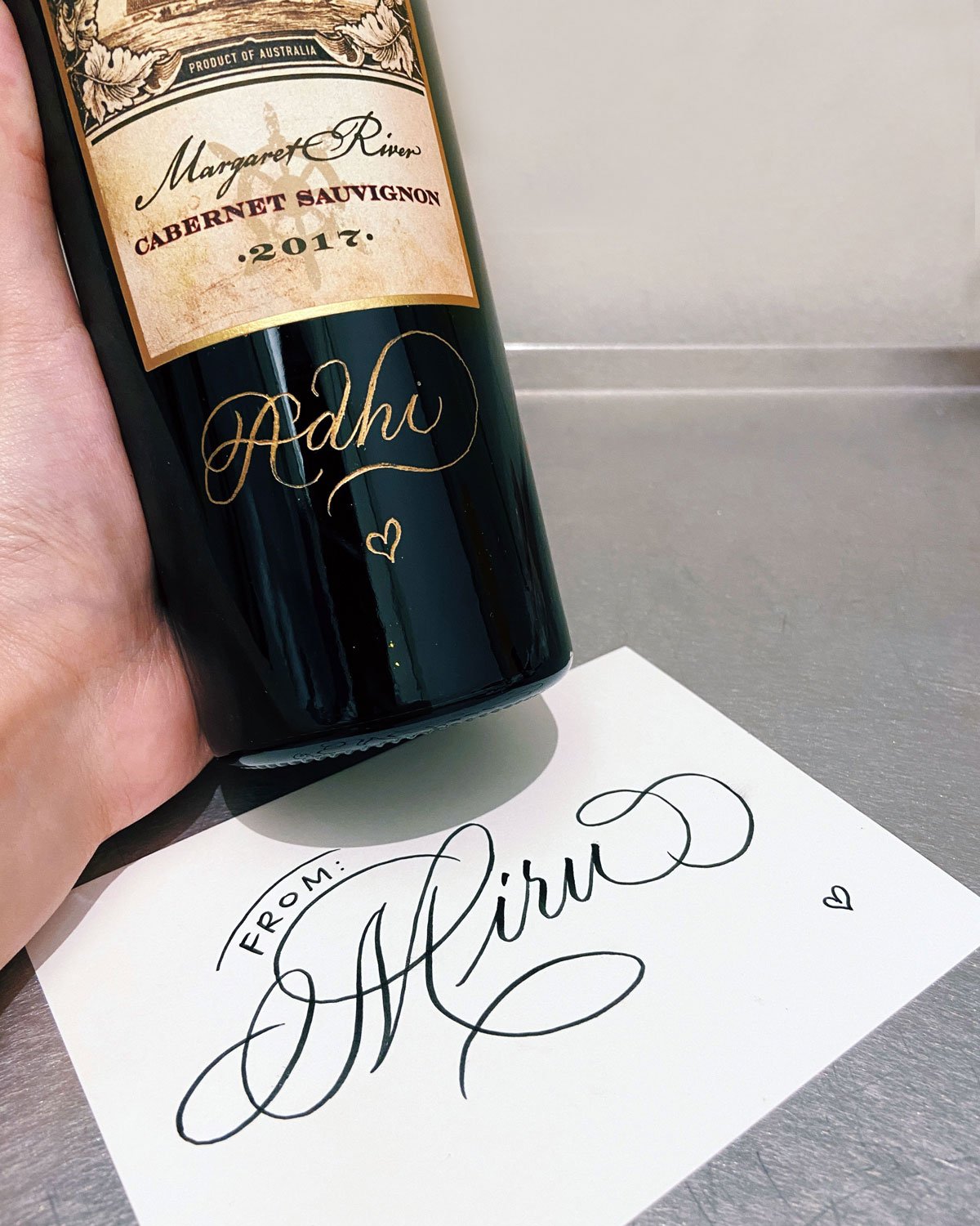
If you are not confident with centring your lines - if let's say it's a little bit too near to the left or a little bit too near to the right and it's not exactly balanced you can always add flourishes to extend your sentences to balance it out.
So for example in this case, the "Frederic" name, I wrote it a little bit too near to to the left so I extended it by adding a little heart shape at the end and that's my usual go-to, to balance things out. In this case and it's only appropriate if it's relevant e.g. if it's a couple, I can add the heart shape but let's say if it's ambiguous I'm not so sure if it's anything like Valentine's Day related or Anniversary related, then I don't add the heart shape. I'll add something else that is like a simple flourish but essentially it works both ways.
So let's say if the word was a little bit too near to the right, I'll add an additional flourish on the letter F - entrance stroke of letter F to extend it further to the left.
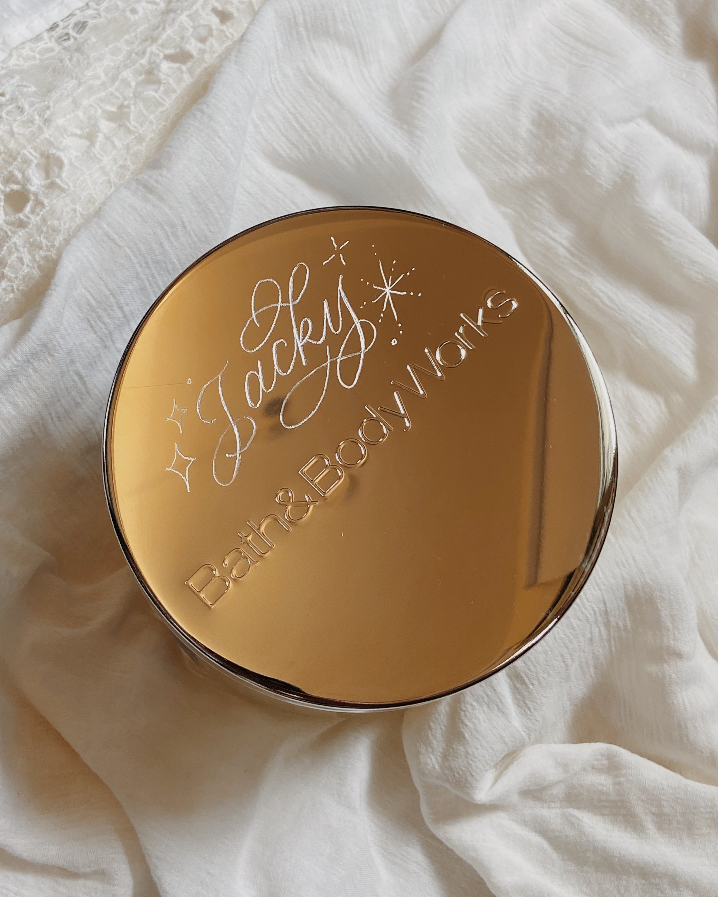
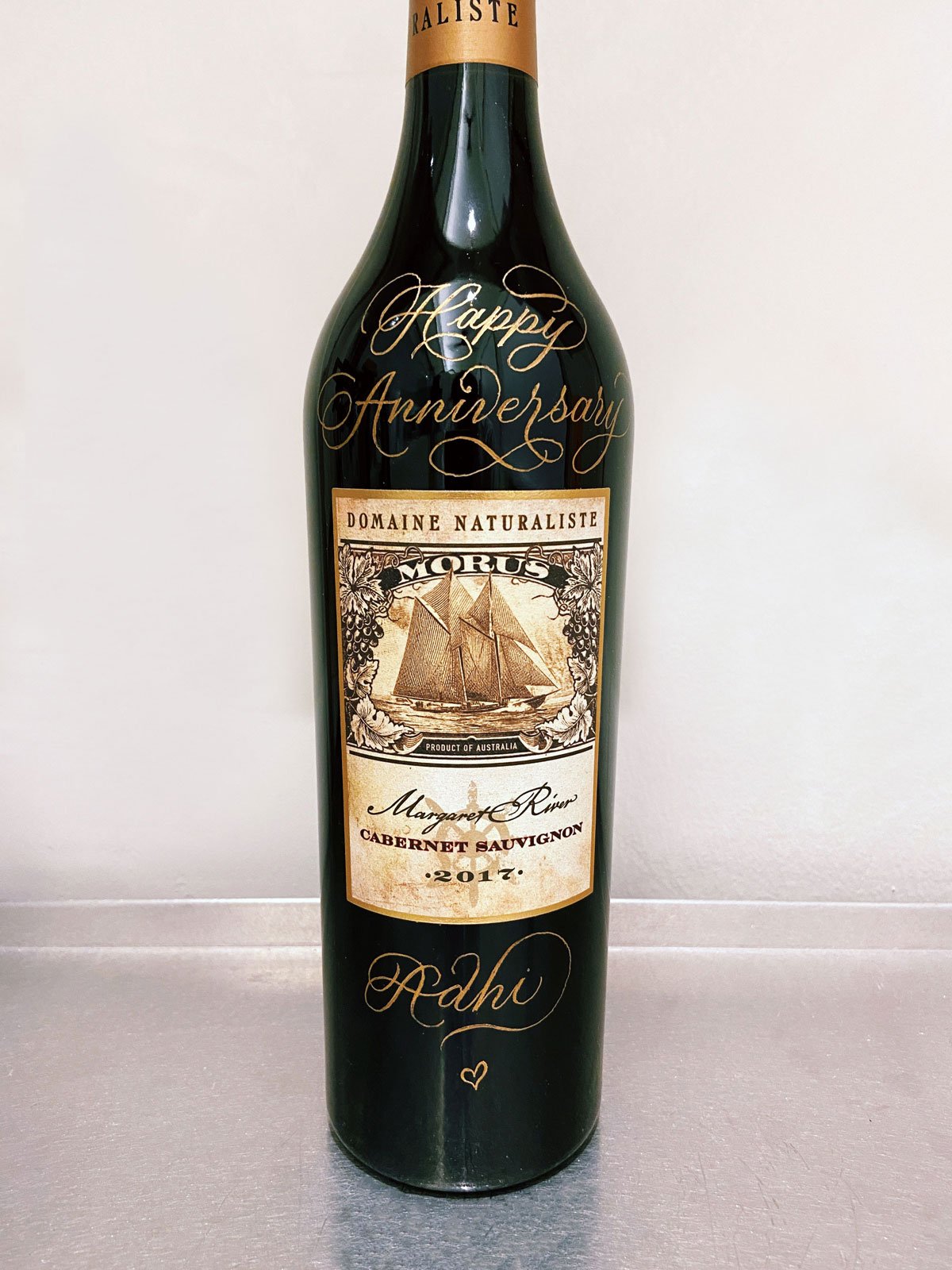
Usually I just kind of freehand and freestyle and whatever comes, whatever goes, you know? In this case, there was a bit too much extra space at the bottom, below the date, So I added a little bit of decorative flourishes at the bottom. And I just completed the whole thing by adding the illustrative stars, especially if it is a celebratory or congratulatory message.
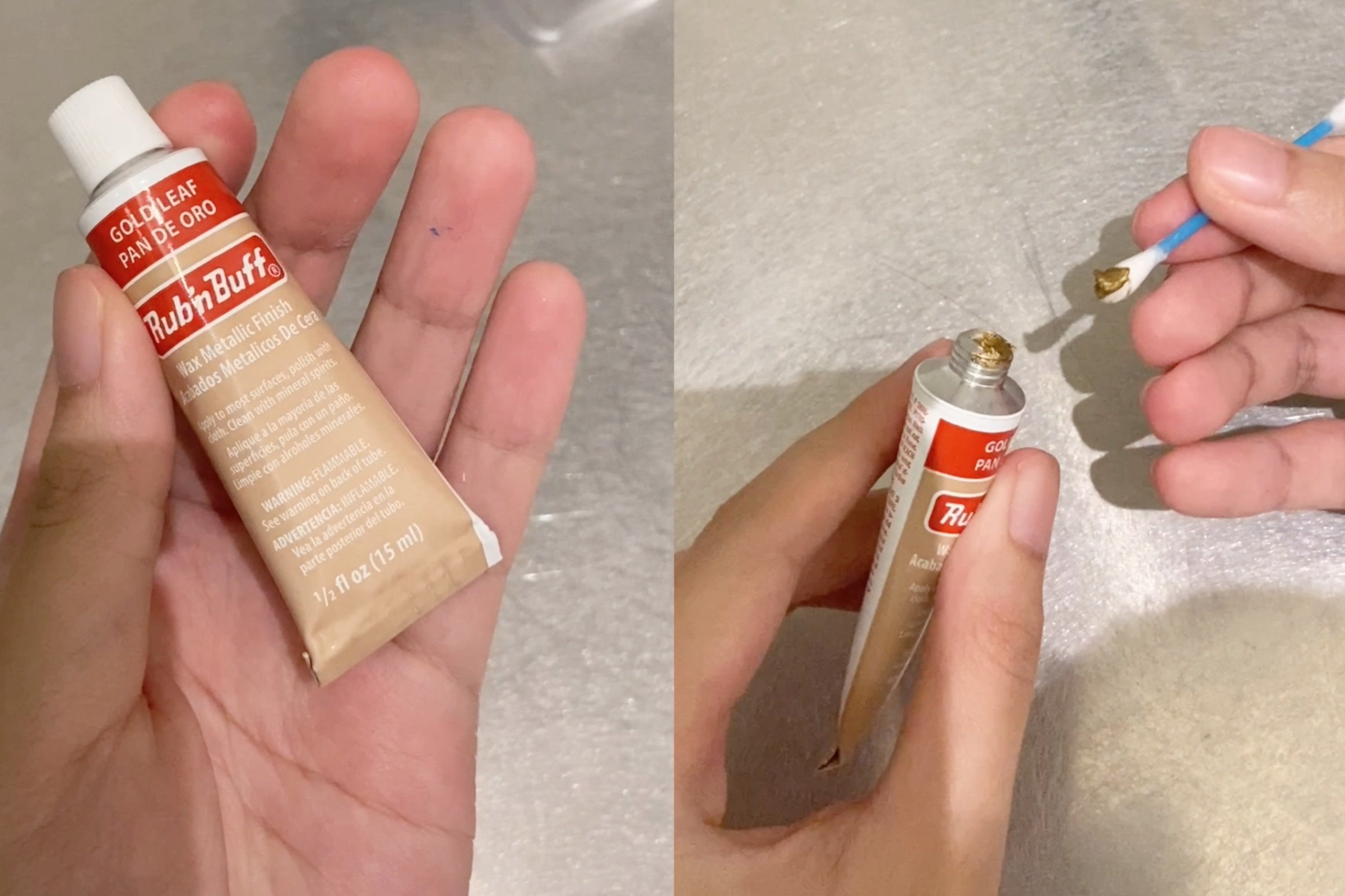
Tip 4: Use an oil-based marker
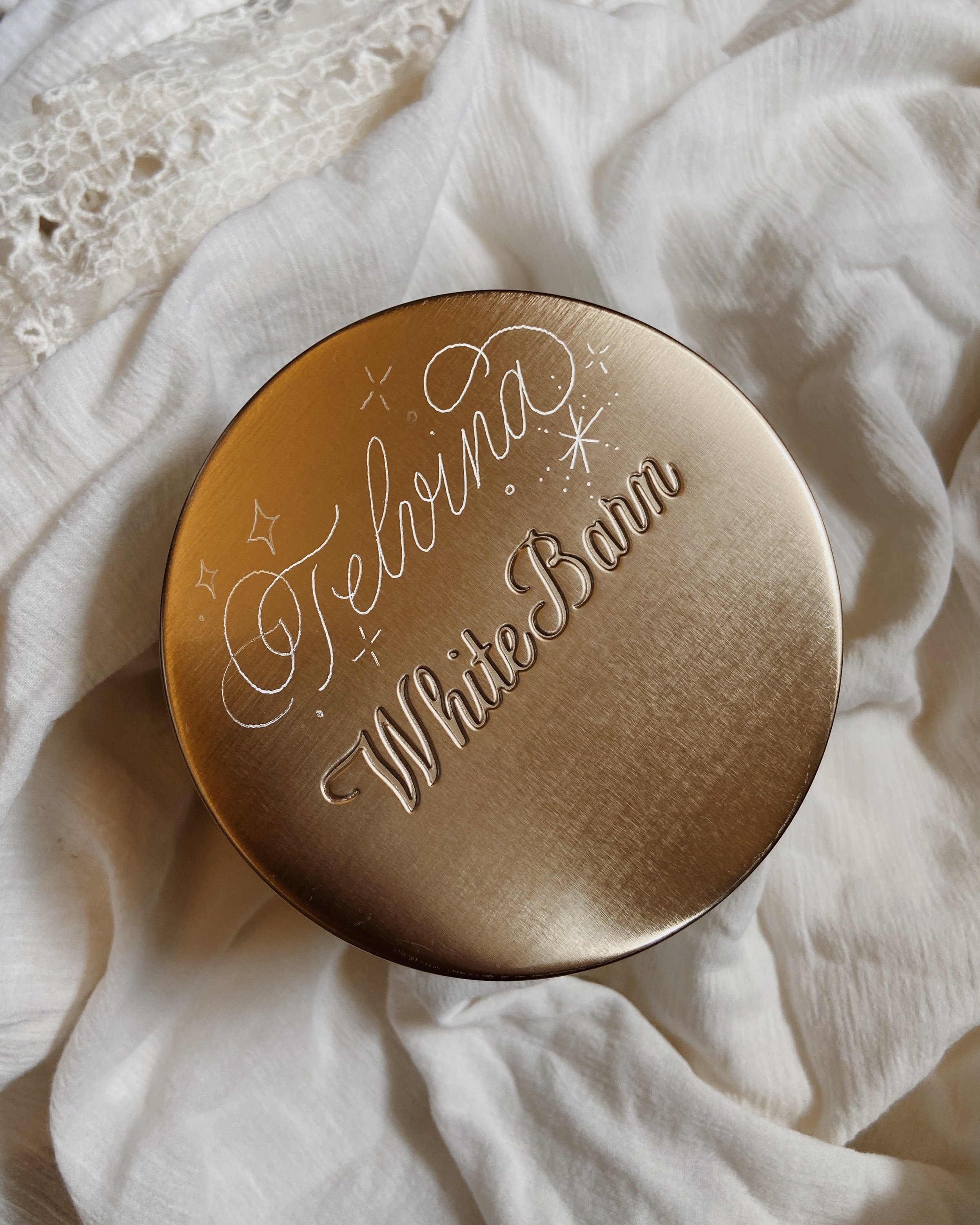
The gold pen I'm using is called the Sakura Pen Touch Gold Pen in fine-tip size. Essentially, you want to go for an oil-based marker and not an acrylic marker - not like a Molotow or any other acrylic-based marker, not a water-based marker like a POSCA because we want to ensure the ink can last. Usually for champagne, the customers are going to put it in the fridge and chill it before they bring it out and you don't want the water from the condensation to ruin your artwork. So you want to go for an oil-based marker because it's more long-lasting and it is ... I wouldn't say it is scratchproof because you can technically scratch the ink off but it's definitely waterproof. For water-based markers, they are not waterproof and acrylic-based markers, they usually water resistant but not waterproof.
My personal preference is… I like a very specific shade of gold which is this particular shade of gold. Not too yellow and not too red tone. If it's red-toned, it's like copper or rose gold and if it's too yellow, it feels very old-fashioned so I like it somewhere, just right. And I also like markers where they dry off with a matte finish, where it looks really clean, very nice, shiny, reflective under the light so yes, it checks all the boxes.
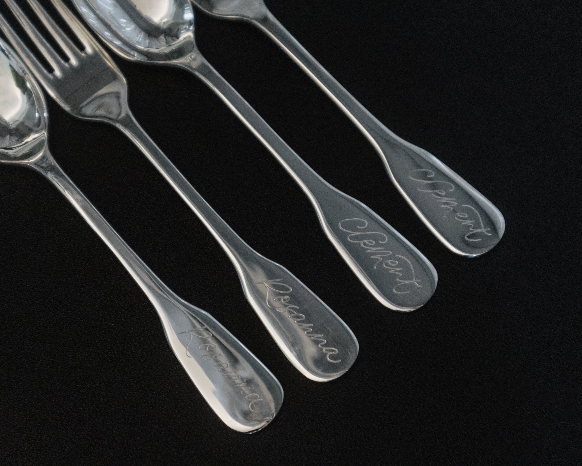
Tip 5: Increase the size of your pen or decrease the size of your pen tip, according to the text length and the bottle size.
For example, if I have a small bottle like a mini champagne or half bottle, I can reduce the marker size from fine tip to extra fine tip. Or let's say I am writing on a 750 ml bottle but the text is long like a 100-word poem, let's say. I don't know who will get that but let's say it's 100 words and I don't want the entire piece to feel very overwhelming, you can reduce the pen size from fine tip down to extra fine so that all the lines still look easy to read with all the negative space.
Likewise, if I'm writing a really big bottle let's say 3 litres, and I only have one word that says "Congrats". Then I can increase the size of the tip from fine to medium-sized.
It's good to have various pen sizes and you can switch accordingly depending on the 1.Text length and 2. Size of the bottle itself.
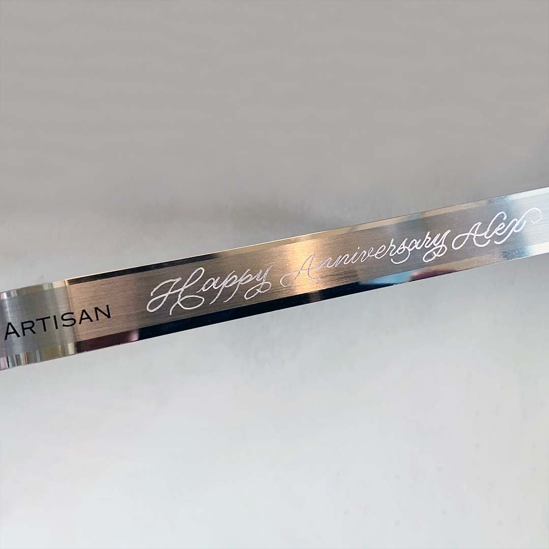
Tip 6: Recommend a custom message that fits the bottle shape for a well balanced composition.

If you notice the shape of the champagne, it's narrower at the top and it goes wider and wider to the base so generally speaking if let's say the client comes to me and says they want a really long word and that's the first word - I try to advise the client: "Is there a way you can rephrase, if possible?"
So for example "Congratulations" is a really long word relative to the word "Audrey" I mean of course if they really want this fixed text I would just say "Yes let me do it for you, I can get it done" but if they are like "Can you recommend me something that is fitting for a birthday?" then I will recommend a phrase that doesn't have a really long word as the first few words.
Generally speaking, you want it to look nice across the entire bottle so if the longer words can sit at the bottom, that would be a lot easier, composition-wise.
Alright, I hope you enjoyed this blog post - if you did, let me know which tip you found most helpful. If you’ve any questions along the way, don’t hesitate to comment your question below or DM me on Instagram and I’ll be sure to answer and help.
Last but not least, I share these thinking that most of the people who watch it would likely be a practising artist - maybe you want to venture into a new material or surface or item or a new service but if you are someone who has not tried calligraphy before and you want to learn and you want to master calligraphy, then I would point you towards my calligraphy course. It's completely online or if you're in Singapore, you can also take it with me in person and even if you are practising calligrapher and you want to level up, feel free to check it out as well.
Anyway, I'm just sharing so if any of you guys are interested you can check it out and there's also a free class preview, you can watch one lesson to see if it's a right fit. If it's not, no pressure, no worries. You can always wait till my next tutorial - feel free to comment on what you want to learn!